
Founder of Senja

Before these changes less than 15% of sign ups activated. After, it's closer to 40% 📷 For us, activated means to use the product meaningfully -> create form, share a form, collect a testimonial. Here's exactly what we did, before and after:
SOCIAL PROOF
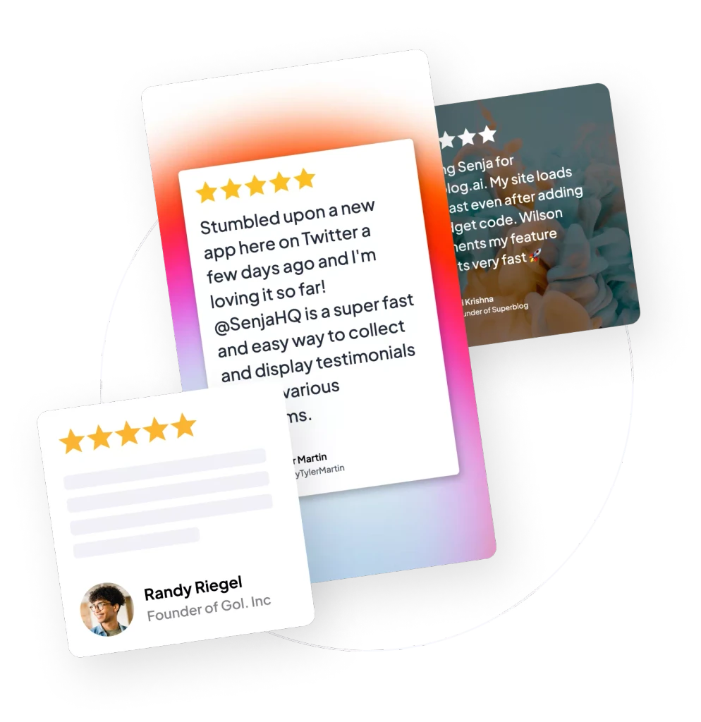
Before: No social proof on sign up page. After: Social proof on sign up page Aim: to acquire more sign ups and increase the desire of those new sign ups. To do this, we added a Senja carousel widget to our sign up page.
REMOVE FRICTION
Before: Sign up with email and password. After: Email and password OR Google sign up function Aim: allow people to sign up and try the product with less effort.
CONTRACT FLOW
Before: We had multiple stages for collecting sign up information. After: Contract this set of questions to one page Aim: Simplify data collection and reduce clicks. (Test this, as I've seen different results with my clients)
PERSONALISE EMAIL SEQUENCE
Before: Everyone received the same email sequence on signing up. After: We use information the new user provides in the flow to customise their experience Aim: always send the right email at the right time.
GIVE SUPER POWERS
Before: Return user to dashboard. After: A screen that demonstrates "Senja is on your side". On submitting their sign up info, we celebrate the creation of their first form. Aim: make the new user feel like they have super powers.
ADD A SMILING DOG
Before: No smiling dog. After: Smiling dog added to the onboarding flow Aim: Smiling dogs = increased activation 📷
FORM CUSTOMISATION IN ONBOARDING
Before: Very few people were sharing their testimonial collection form without customising it. After: Added form customisation sequence into onboarding. Aim: optimise for the effective journey.
ONE THING AT A TIME
Before: return people to a dashboard with a menu. After: New user has only ONE THING TO DO at a time. And once completed, ONE MORE THING TO DO Aim: No dead ends.
NO EMPTY SCREENS
Before: New users were greeted with empty dashboard screens. After: New user sees a dummy testimonial from my co-founder @euboid. This follows our belief in show not tell Aim: Help new users understand and explore your product more.
GET THEM TO DELIGHT
Before: First email arrives after their first testimonial. After: A 'fake' testimonial from me is posted to the new user's account after one hour Aim: we know this email is a moment of delight for the new user, so we wanted to showcase it sooner.