Features

Customers

Why Senja?

Resources

Features

Why Senja?

Resources

The Testimonial Blog

The Testimonial Blog

People love our landing page. Here's why we're changing it (for the 5th time)

People love our landing page. Here's why we're changing it (for the 5th time)

Cofounder of Senja

Me and my co-founder Wilson have spent the last 9 days working on a new landing page for our SaaS Senja.

This has involved multiple long conversations, deep research, copywriting, design, front-end development, iterations, and existential questions about our business.

So when customers and our #buildinpublic pals constantly tell us they love our landing page, why did we go through the hard work and pain...?

In this blog I will share the reasons with you.

🦖A quick note: Senja is about 12 months old and this will be the 5th version of our landing page.

Full before and after

Before I jump into the reasons we changed our page, and the specific changes we made, here's the before and after. I'll dive deeper into each specific change below.

Here's the Senja landing page before the changes

This is version 4 of the Senja landing page.

Here's the landing page after

This is version 5 of the Senja landing page.

Why we wanted to change the landing page (and what we've done)

There were 7 key reasons we decided to update our landing page which I've outlined below.

I've paired each reason with an outline of how we addressed it, and screen grabs showing the changes we made.

1/ Performance

Reason

The first reason was performance - although we saw okay conversion on the old landing page we believed there was an opportunity to increase it.

Dependent on marketing channel our conversion rate was between .5 and 5%, with a blended rate of around 2% across mobile and desktop.  

Conversion is an outcome of the other reasons. We felt if we effectively addressed the issues below, our conversion to sign up would increase. More on this later.

2/ Our product has changed

Reason

We've been iterating fast at Senja, we launch multiple features and refinements a week. Our landing page no longer completely reflected our product. Where we had updated the page, some of the concepts were messy and inconsistent.

For example we had 3 landing pages elements about sharing testimonials, two were visual and one was a video, and all were visually uniquely.

We also launched our Social Proof Studio, new image styles, new import sources and new widgets in the last few months.

Before

After
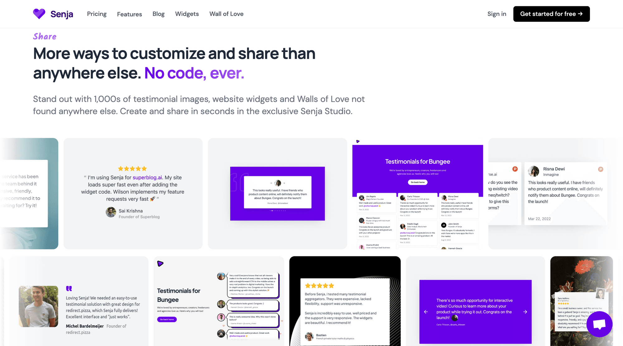
The sharing section of the landing page is much more simple. There is now one bold, scrolling element that visualises the different ways you can share your testimonials.

As well as this, rather than playing a video to preview widgets, the visitor can see literal examples directly in the page. This is supported with logos of where you can share - more on that later.

3/ Speak directly to buyer personas

Reason
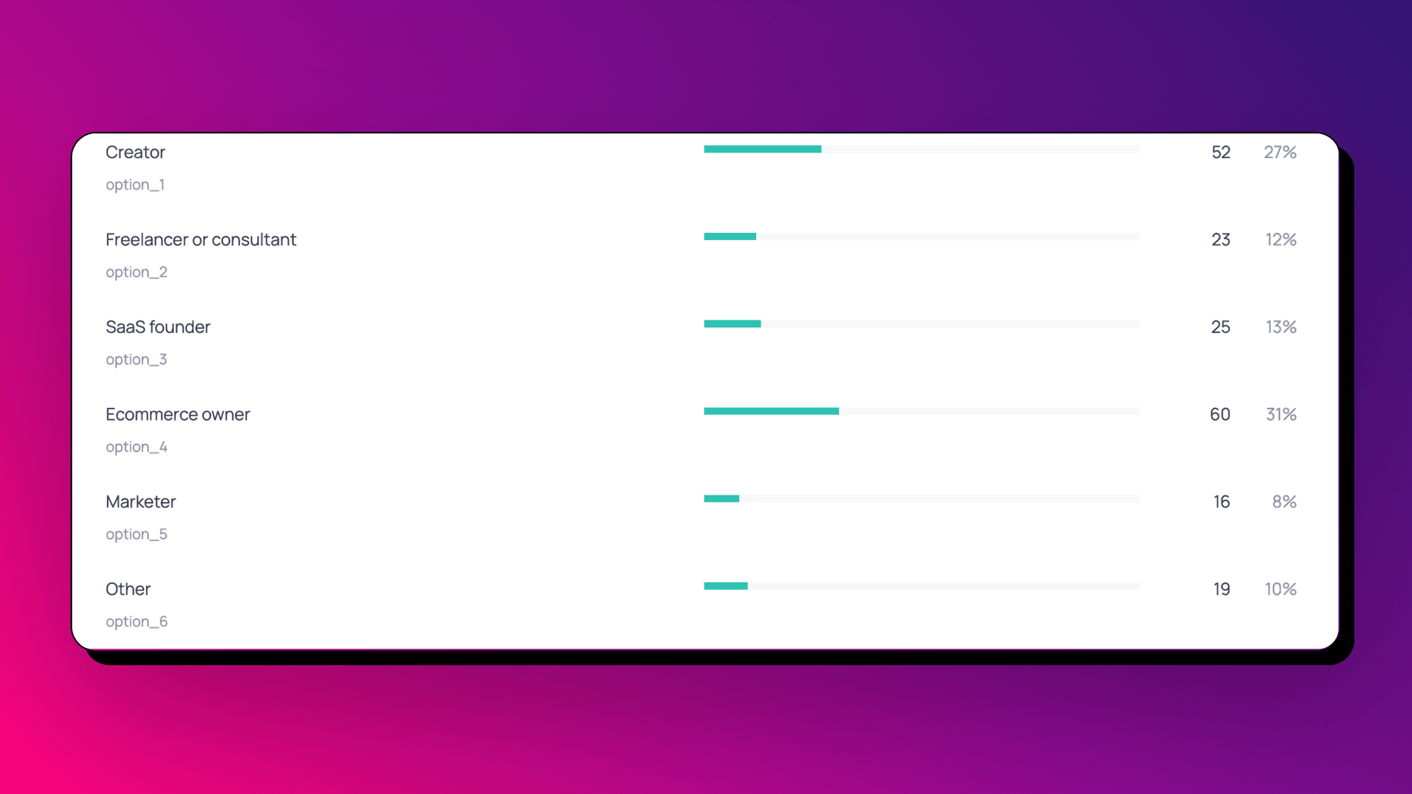
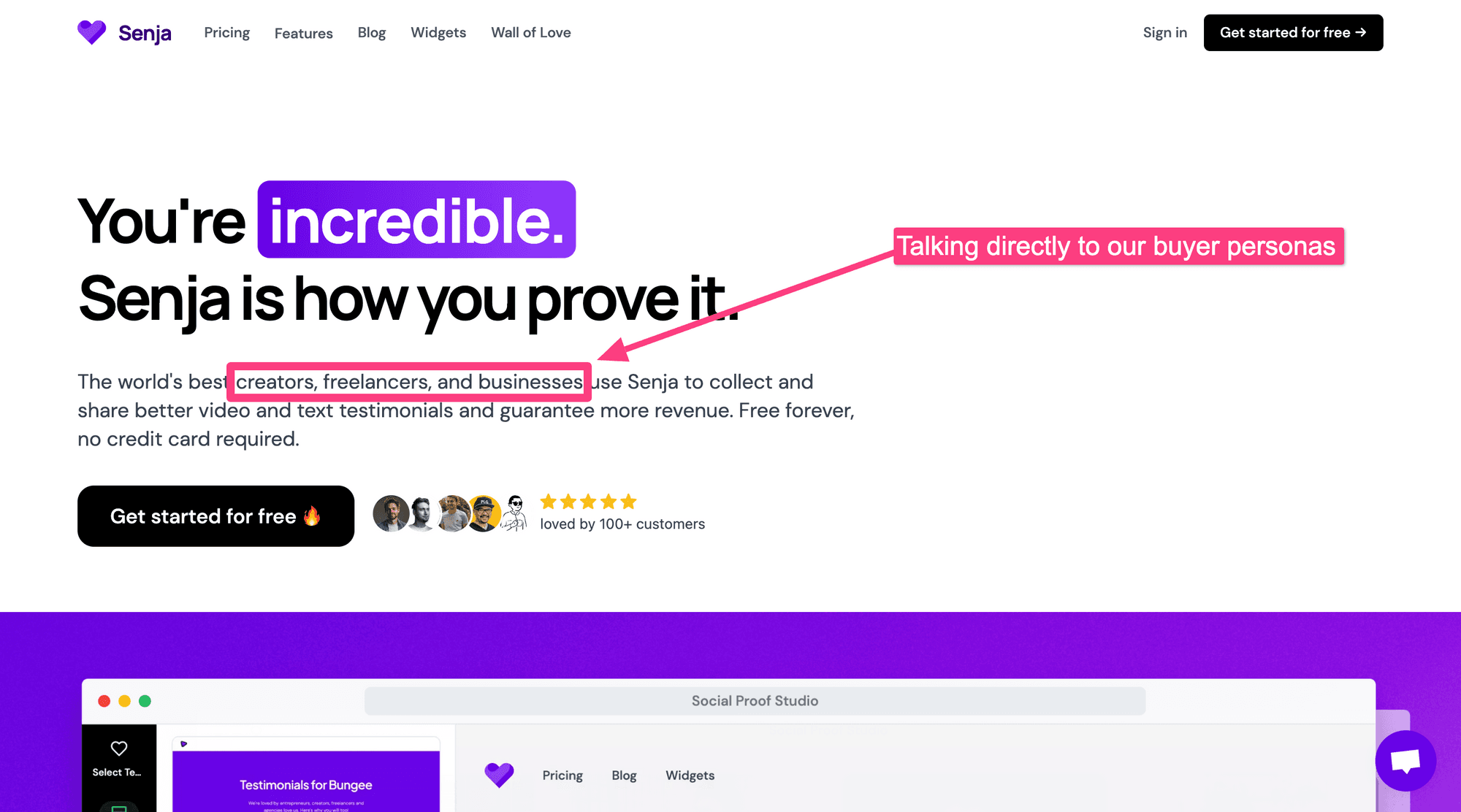
We ran a quick micro-survey on our landing page and realised there is a big blend of different buyer personas visiting the landing page - freelancers, founders, business owners, creators. We wanted to make sure these visitors were addressed on the page.

Before

There was little mention of specific buyer personas on our landing page.

After

Our Hero copy now addresses our buyer personas to say "yes, this is for you!".
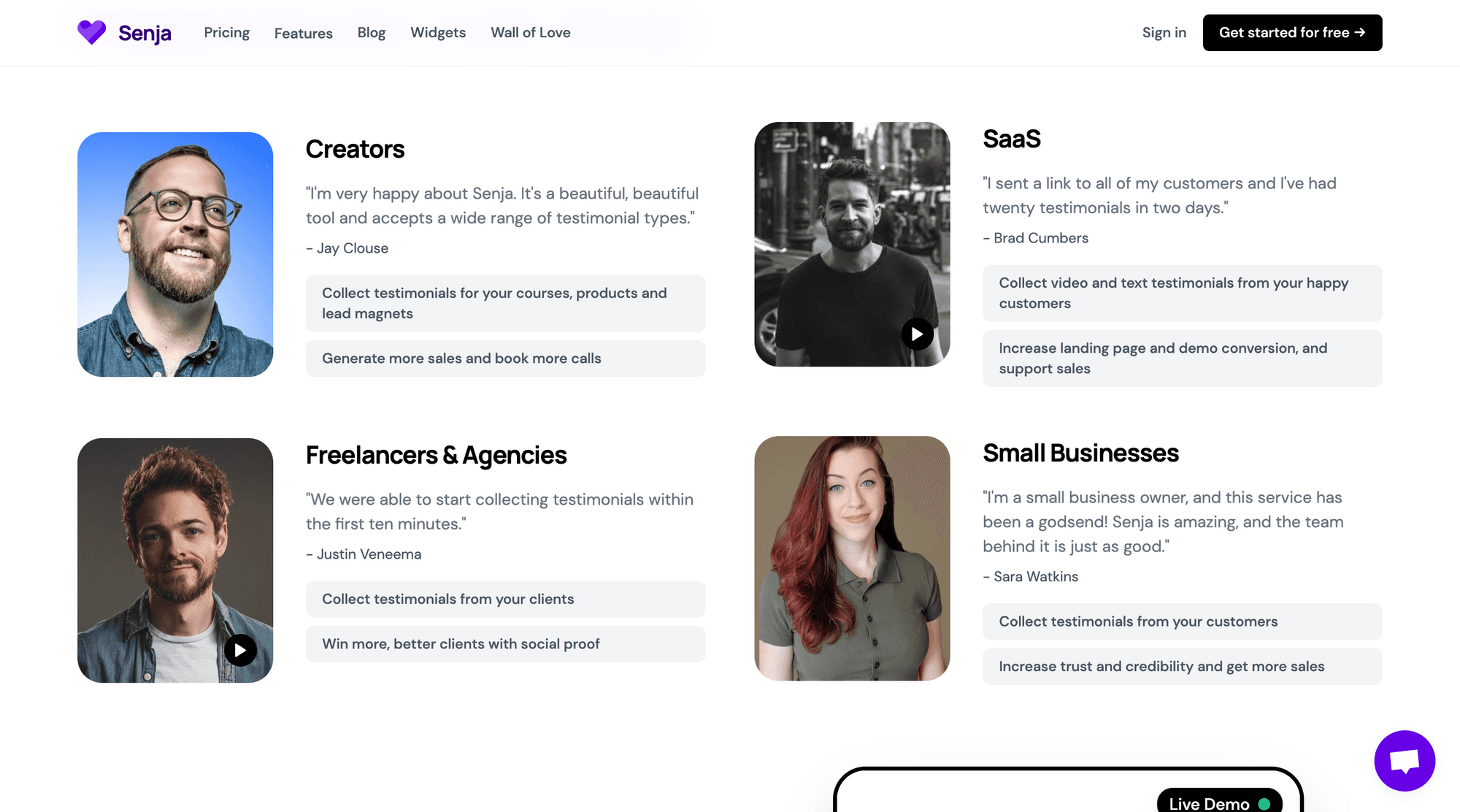
There's also this new section that highlights customers from our key buyer personas. It includes a testimonial from them, and outlines their common use cases.
4/ Show not tell (and educate)

Reason

We felt there were more effective ways to show our product in action, rather than describe it. We saw websites using images and demos in powerful ways, and wanted to explore introducing them too.

Before

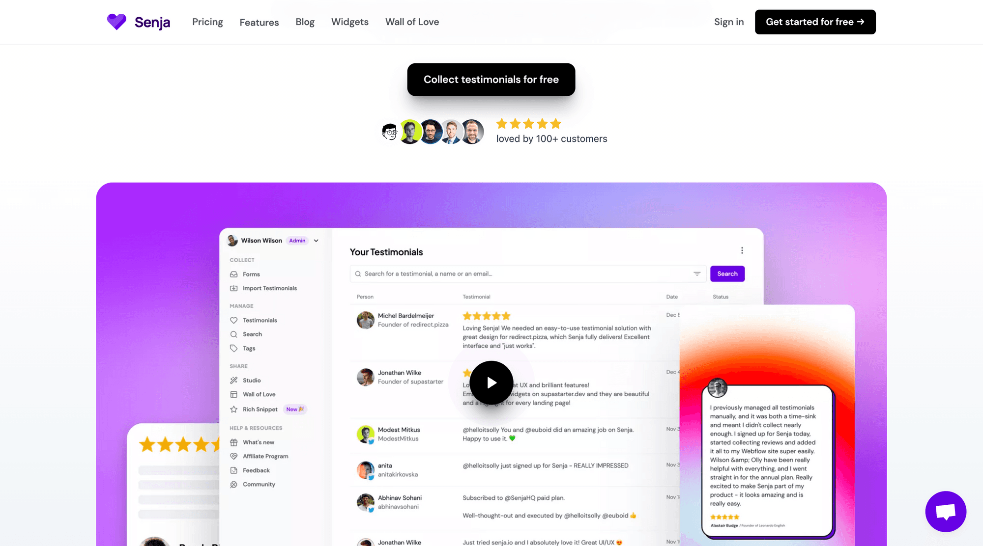
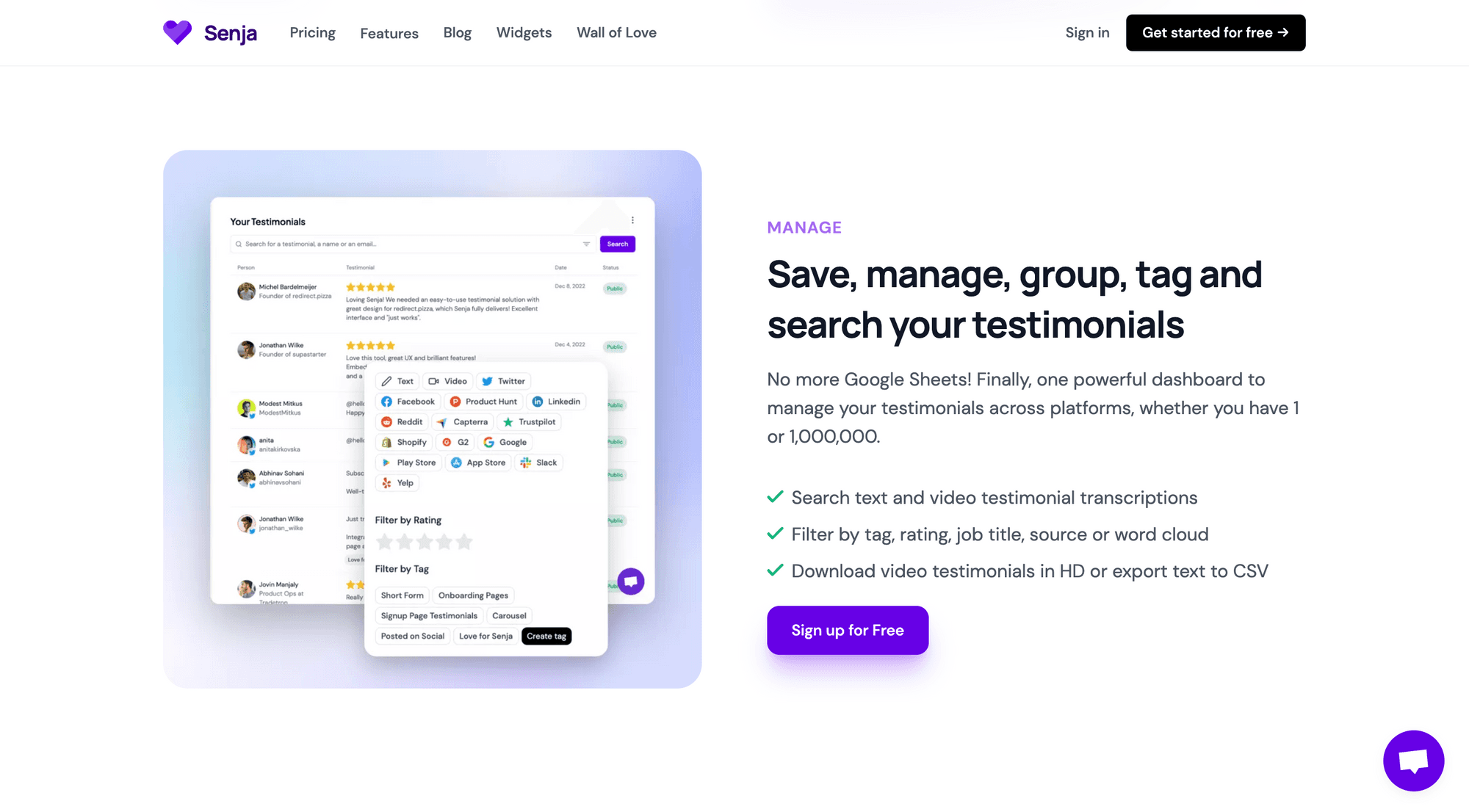
The Hero product image showcased testimonial management, and we linked to an 8-minute product walk through video. We also included some product shots throughout the page - especially tied to our key features.

Here's the old Hero product imagery:
Here's an example feature section with product imagery:
After

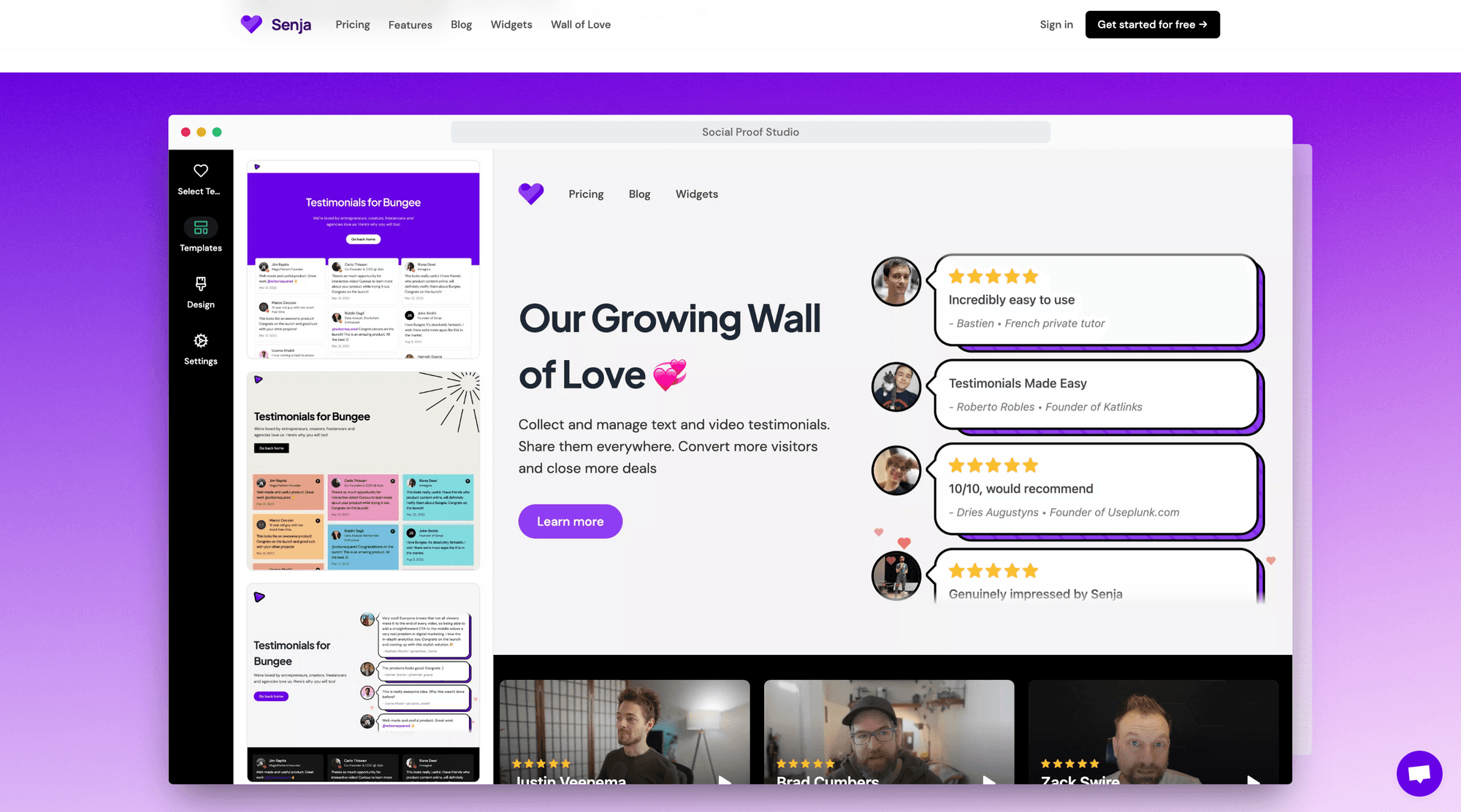
There's now a slider of the most impressive app screens in the Hero. These showcase our Social Proof Studio (which we consider one of our USPs) instead of the less-inspiring testimonial management screens.
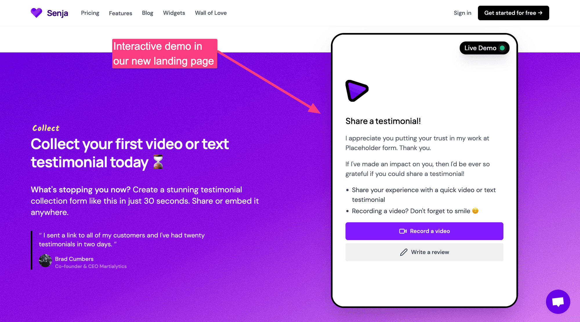
And, the collect image has been replaced with a real, interactive demo. Users can experience our product and leave a text or video testimonial directly in the page.
5/ Make video use case more clear

Reason

We noticed in our paid Google Ads experiment that phrases with video in performed well. We wanted to ensure the copy made it clear that we allow people to collect both text and video testimonials.

Before

Our landing page copy often said "Senja helps you collect text and video testimonials".

After

It now says "Senja helps you collect video and text testimonials".

6/ Address objections

Reason

  • Can I import testimonials?

  • Can I embed them on .... ?

We were being asked these questions a lot; over our chatbot, social DMs and email. We wanted to address these common objections more clearly on the page.

Before

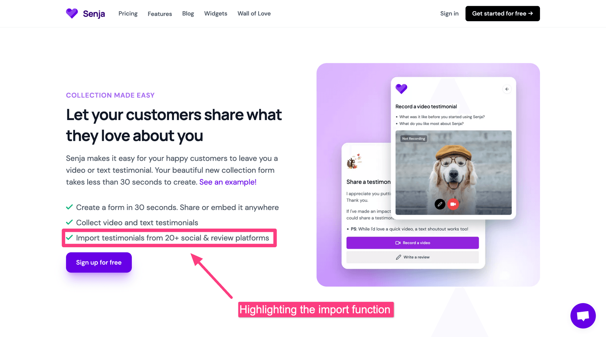
We did address these questions on the landing page but in the form of one line of copy. The answers were obvious to us (yes, and almost anywhere) but not to our visitors.
After

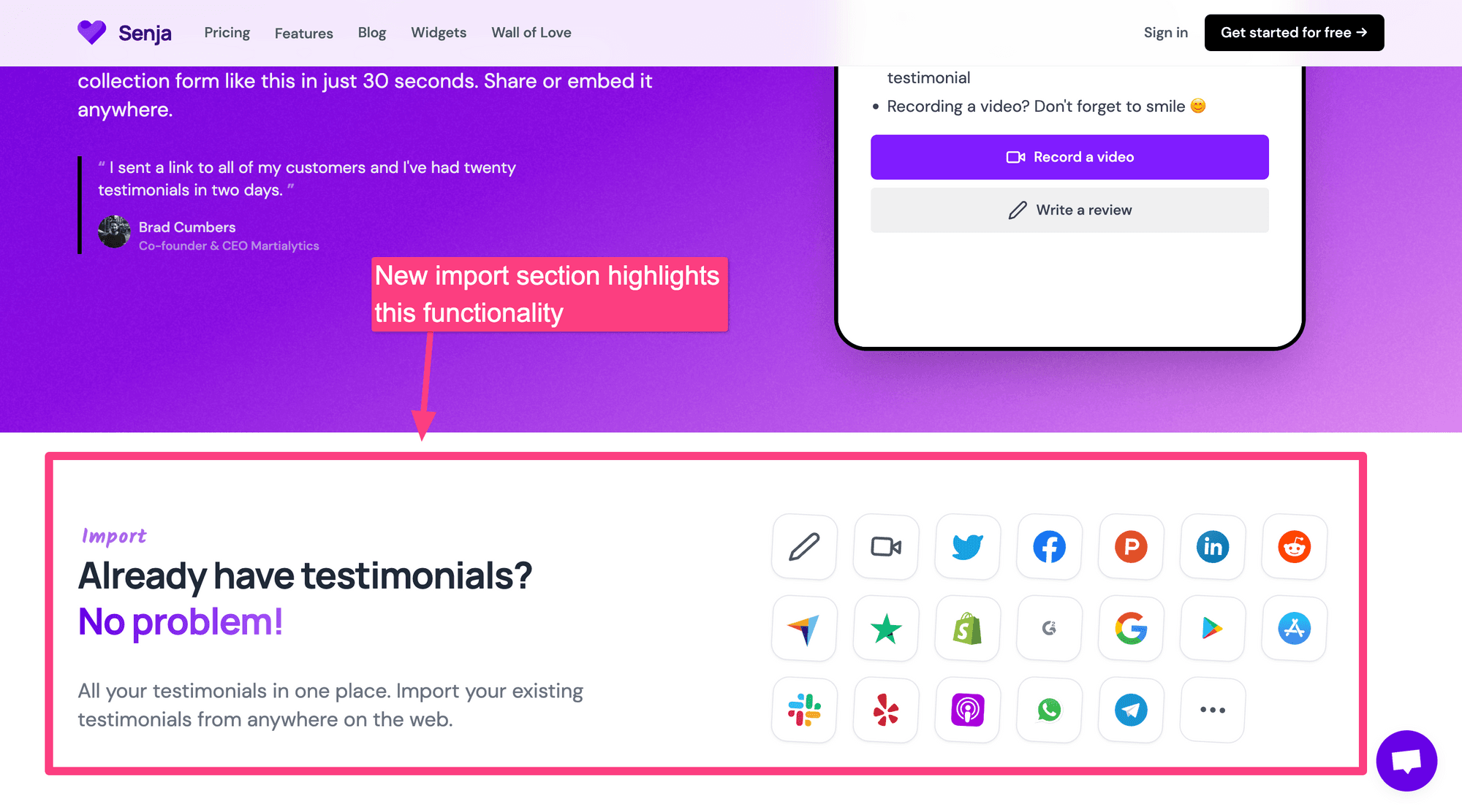
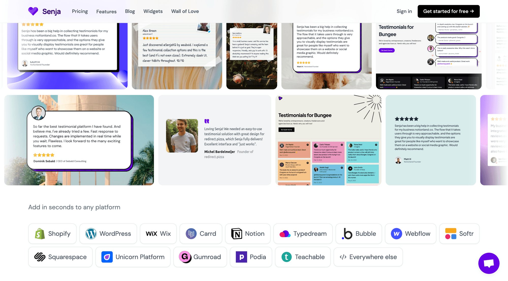
You can see new visual elements next to the collect and share sections. They show this is possible, and the exact platforms we integrate with.
7/ Be bold and add more character

Reason

We wanted a landing page that was bold and had more character.

Before

We believed our current landing page was good, and followed established SaaS design and conversion patterns.

But we wanted to be more playful (and potentially controversial) with the copy and the design, which reflects the business we want to build - useful, but fun, bold and opinionated.

After

There are lots of small tweaks and elements on the new landing page, some of which are already proving controversial. For example, the headline.

We decided to make a declarative statement that would encourage people to read on, rather than use something literal. There's also an Easter egg hidden in the Hero.
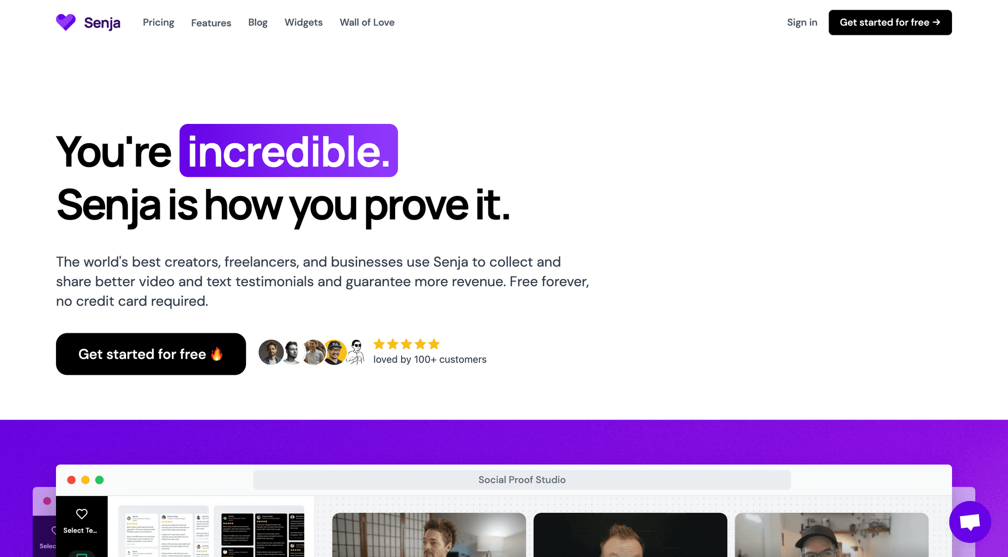
For the manage section, we're trying 'tell now show'. Rather than show the (sort of) dull testimonial-search screen, we're showcasing lots of different types of testimonial searches you can make on Senja. This also has the benefit of educating visitors.
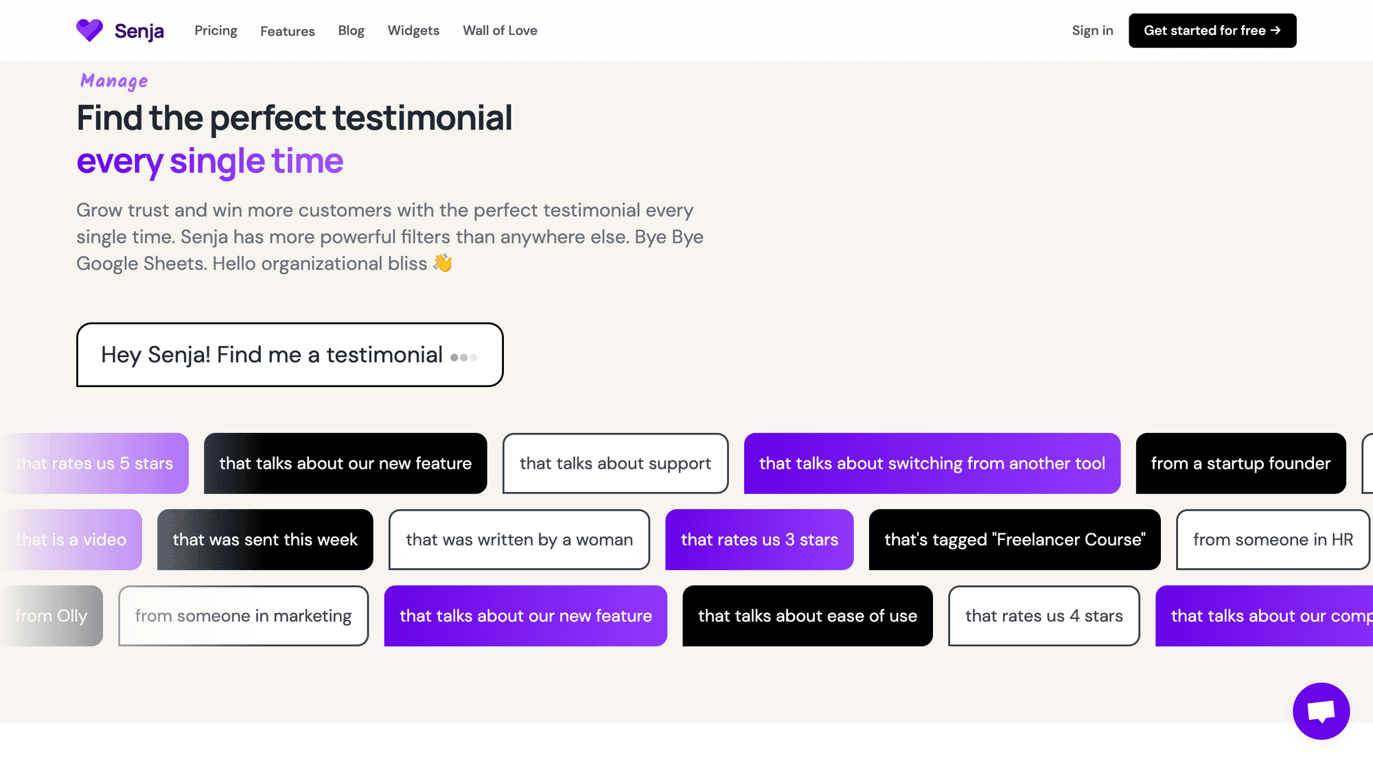
Finally you can see this new wall of text. We want to energise our visitors and drive them towards action.
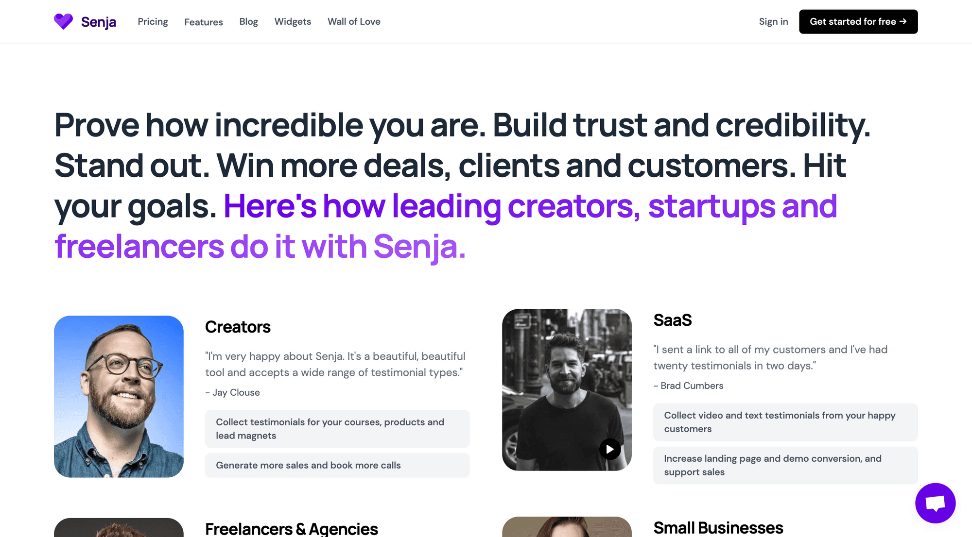
We also wanted the copy to feel bolder - like Senja is the only destination for social proof. We're a young company but we wanted to feel knowledgeable, confident and fun.

So we've introduced short, concise declarative sentences, comparisons with other platforms, more adjectives and vivid language, and bigger CTAs and design elements.

How we did it: the process

Here's a summary of the process we followed to deliver the new landing page. This is not a perfect process, or a complete outline, but should give you an idea of how me and my co-founder collaborate on work.

For context I (Olly) am the marketing co-founder, Wilson is the developer co-founder, and we share the product role.

Day 1

Warm up conversation

After a few hours of calls on Around reflecting on the issues above, looking through various SaaS landing page directories, and riffing on what we've learnt about our customers, and the type of business we want to build, we got to work.

Wireframe / ideation

We started in Miro, collaborating on a new design that we felt met our goals. This process took about 2, 2-hour sessions and we completed it over a day. We work remote but we were on a call for most of it.

Day 2: Build in code

Wilson started by quickly turning our wireframe into code so we could see whether the concepts discussed would work or not.

By doing this we could see if the structure of the page flowed well, without having to worry too much about design.

Day 3 & 4: Refinements and collaboration

Over the next two days we collaborated on:

  • The structure of the page

  • The copy

  • The design of each section: collect, manage and share.

Wilson and I would share ideas for the page. We'd discuss them together on a call. Then Wilson would implement them in code.

Once they were implemented, we'd stop, take a fresh look, then discuss what was wrong with the page and how we could improve it. We used screen shot tools to capture feedback, like this:

We repeated this feedback cycle about 4 times. Each time, we'd

  • remove things we thought were unnecessary, repetitive, or cluttered up the page

  • clean up design elements that were too messy, too small, or took up too much space

  • make the copy even clearer

  • and experiment with new layouts for each section

Day 5 - 7: Break

We decided to take a break from working on the landing page. We were becoming unproductive. We took a three day break (Fri - Sunday) so we could come back and review with increased energy and fresh eyes.

Day 8: Getting Feedback

Wilson posted on Twitter asking for feedback for our hero.

Which hero do you prefer? A or B? pic.twitter.com/7M1LDrTKIg

— Wilson Wilson (@euboid) March 27, 2023

After receiving over 100+ responses on this tweet from the build in public community and sharing our page with some friends on Twitter, we discussed the feedback we received and continued working on the page.

Day 9: More collaboration and finishing up

We spent Day 9 tying up the page's loose ends.

  • Tidied up the copy

  • Improved design elements

  • Added missing hero images

  • Added Google Tag Manager and meta data

It's good enough

We decided the new page was good enough to test.

We didn't want to keep refining, without having some performance data to review. We decided it's good enough and any further work might represent a poor return on our time. So started an AB test comparing the new page with the previous one. Details are below.

Should I update my landing page?

That's on you, but take a look at my list of reasons above.

If any of them click with you, perhaps it's worth taking another look at your landing page execution. You should add your own visitor surveys, review your analytics, and assess if the page you have now still reflects the business you are building.

Results - does the new page convert better?

We published the new page on March 29th 2023.

We're running it as an AB test, versus the previous design. You may or may not be able to see it live here (depending on if you enter the test).

Once we have results on the new page's performance, I'll share them here.

Everything we did was based on insights and qualitative feedback, but we'd still like to see if and how these changes impact conversion.

You can also follow me on Twitter for updates on the page.
Collecting testimonials doesn't get much easier

Collect text and video testimonials — Share them everywhere!

Sign up for free

Testimonials Made Easy

The faster, easier way to collect testimonials

Jump in today and see how easy it is to collect testimonials with Senja.

Testimonials Made Easy

The faster, easier way to collect testimonials

Jump in today and see how easy it is to collect testimonials with Senja.

Testimonials Made Easy

The faster, easier way to collect testimonials

Jump in today and see how easy it is to collect testimonials with Senja.